So let’s have some fun and bring design in this section rather than focusing only on the sketching side. For this, I have decided to design a product, which one?
A conference call (speaker) for one of my favorite brand: Google
(Let’s be clear here, Google hasn’t asked me for it and this is only me creating a concept for a brand I like). You can see the rest of their products here
It’s a good exercise to do if you want to detect the design codes of a brand (Brand DNA / Design language) and apply them to a new product. To be honest, I did these sketches in a few hours between 2 projects so you won’t see the real process of researching and analyzing the brand, etc… We’ll do this another time. So for now, let’s focus on the creative side and have fun…
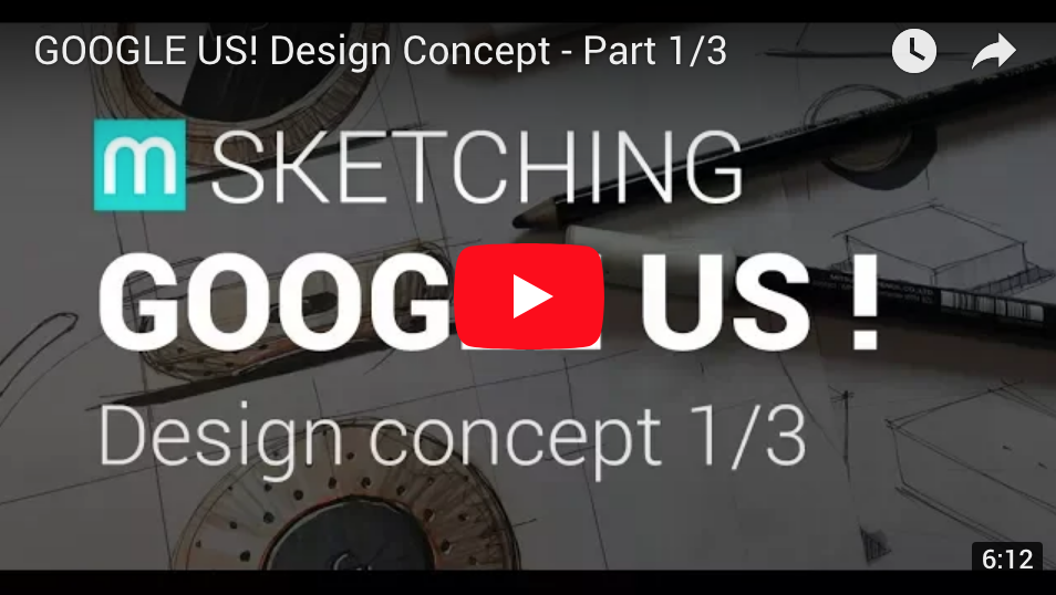
Video 1: Sketching
Video 2: 3D and renderings
Video 3: Prototype?
OBJECTIVES
Fun! What I enjoy most is to work on the details as they really are what matters in a design. I often see designers sketching their ideas quickly and avoiding to focus on the details.

The trick to stay creative is to put your idea on paper, then think “now that I have this idea, let’s spend some time to add the details to it”. It’s like applying a second layer of thoughts on top of your idea. And as you improve it by thinking it deeper, your next idea will naturally come as you are sketching these details. Try it!
If you struggle with this, feel free to Download the 3 videos in which I explain this trick in more details.
So here, the details I focused on are:
SIMPLICITY
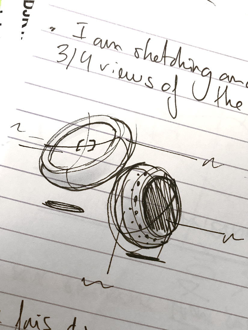
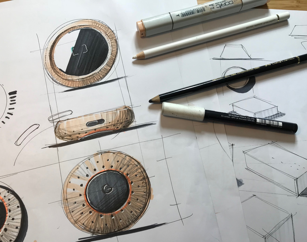
Simplicity expresses the ease of use of a product. If it looks simple, it feels simple to use. That’s why I designed it around a basic geometry: the circle, perfect symbol of simplicity. Also as I have no real clue about the actual placement / components of this product and since we’re just having fun, I kept it compact and modern and have something that you’re willing to hold in your hand.
DETAILS / INTEGRATION OF THE FEATURE
From the integration of the LED (glowing on the table rather than in your face), the parametric array of speaker dots or the minimalist On / Off button. Each feature is made to be seamlessly integrated and remove any aspect of complexity. Why? Because if your product is simple, it feels simple to use therefore more people ar likely to try it and adopt it (i-phone or the NEST thermostat are great examples of this).
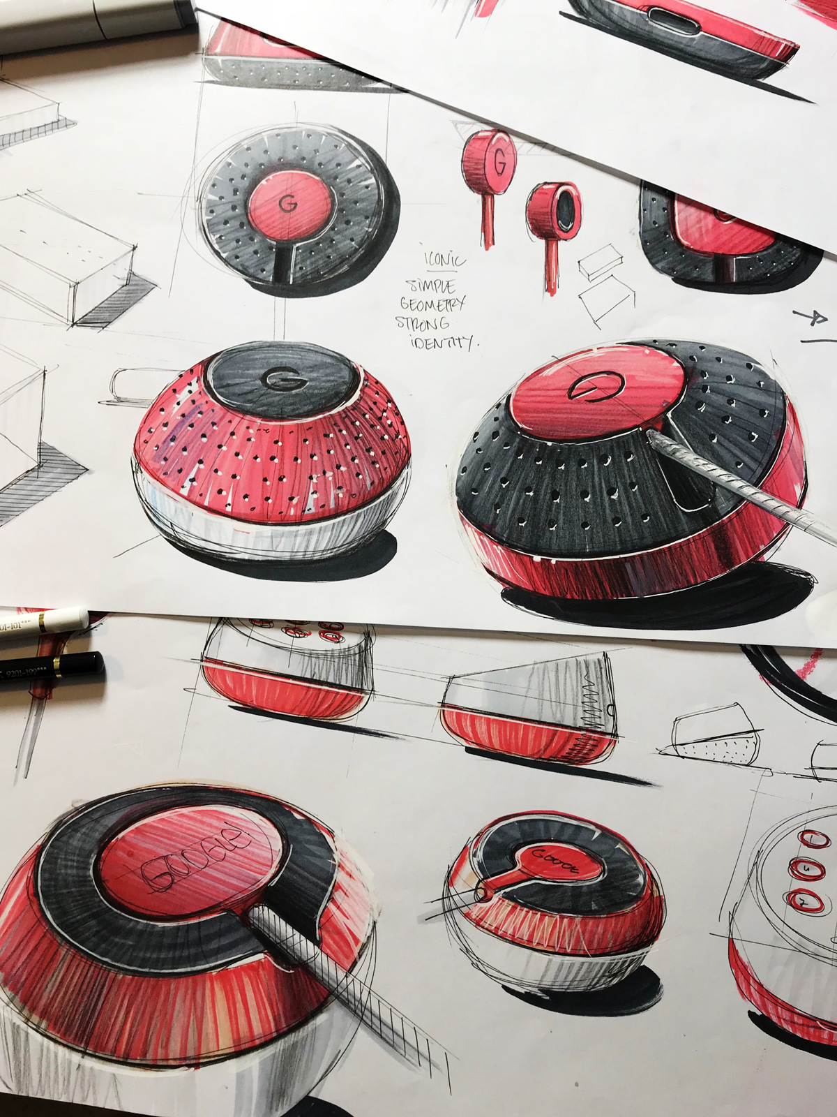
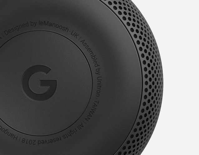
CABLE & RUBBER GRIP
The rubber grip at the base, typical from Google products with the minimalist “G”, is used for the grip of course, but also to reinforce the feeling of quality as you’ll get a “soft sound” when you put it on the table rather than a cheap plastic “Bing” sound. I am still working on the cable management but you can see an idea of what I’m going to do in this sketch.
SCREEN TO FACILITATE INTERACTIONS
These devices are usually hard to understand and even harder when it tries to say all types of messages with a liking LED. So, boom, just a screen will allow to solve many of the frustrations. Even if I think Google tends to use the phone as the interface, I’m just concept..ing here
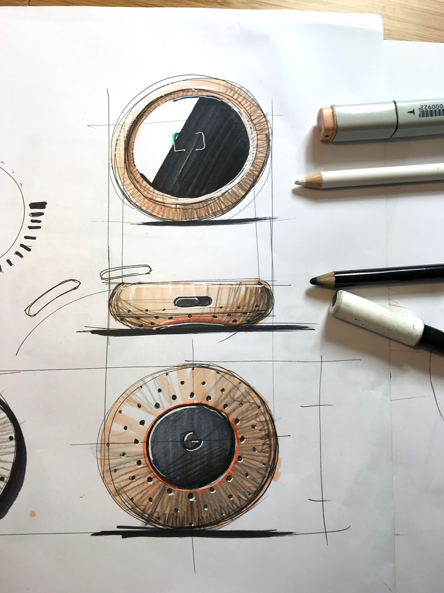 CMF
(Color, Material, Finishings)
CMF
(Color, Material, Finishings)
Does professional devices have to be made a black plastic? Is this representing your company when it’s seating in the middle of your meeting room? So rather than designing a “machine”, we’ll apply a CMF that make you proud of having and showing to your clients. Rather it’s a copper or a brass, I’ll figure this as I move onto the next article.
OVERALL SHAPE
Exploring the general shape, treating the surfaces and where to apply the part lines, proportions and material breaks will be key to make it a beautiful and functional object
Well, that’s all for now!
Next step is to model this and go further into the details especially the cable area and parametric speaker with Grasshopper!. Let’s also see if we can make a quick prototype or 3D print of it.
Cheers guys!
Alex